The useful answer is rarely a single palette printed on a card. Clothes have texture, shine, scale and distance from your face, and those details can make a supposedly perfect shade look oddly flat. Instead of chasing a permanent verdict, use a few repeatable checks to notice which colors make your face look rested, clear and present in ordinary daylight.
Start with the clothes that sit next to your face
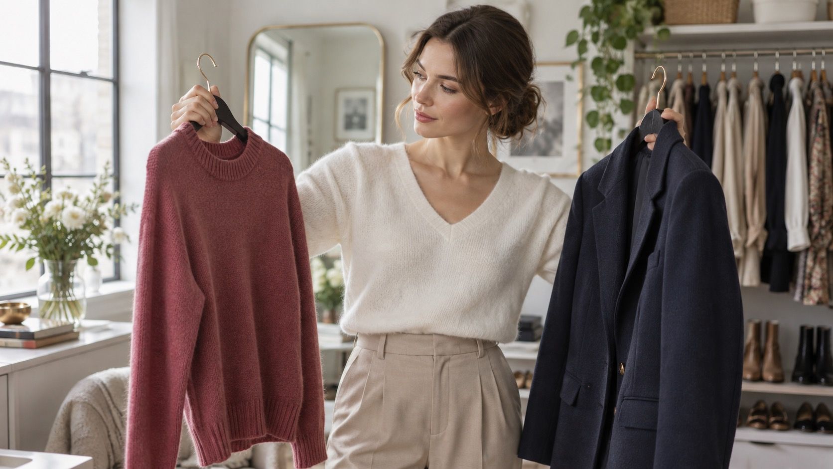
A skirt in an unflattering color is usually less dramatic than a sweatshirt, shirt collar or scarf in the same color. Begin with tops you already own and stand by a window around late morning, without yellow lamps or a heavy filter on your phone. Hold each top under your chin, pull your hair back if it normally covers your neck, and look first at the skin around your eyes and mouth. The better color tends to make those features readable before you start inspecting the garment itself.
Use undertone as a clue, not a rulebook
Compare close relatives rather than a random rainbow: navy beside black, ivory beside optic white, dusty rose beside peach, forest green beside olive. This is where the question what color clothes look best on me becomes manageable. You are not trying to prove that one shade is universally bad; you are seeing which version asks your face to work harder. If dark charcoal makes under-eye shadows more obvious while softened navy does not, that is useful wardrobe information.
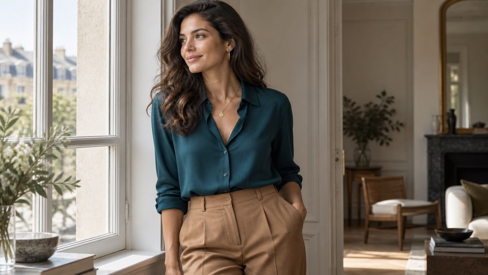
Warm, cool and neutral are helpful directions, but they are poor prison guards. A cool-leaning complexion may still look excellent in a muted camel, while a warm complexion can wear a deep blue beautifully when the blue is not icy or overly bright. Test a warm off-white and a blue-white near your face, then compare silver-colored and gold-colored jewelry in the same light. Notice which choice gives the skin a more even appearance instead of focusing on whether your veins match a chart.
Fabric changes the result too. A shiny mustard satin reflects yellow onto the face differently from a dry, softened ochre knit. Likewise, a cool pink jersey may be easy to wear where a blue-pink satin blouse feels severe. Keep notes in simple language: “cream works better than white,” “berry works better than coral,” or “warm brown works only with a deeper lip color.” A personal color palette becomes useful when it records evidence from your own closet, not when it demands obedience.
Match color contrast to the contrast already in your features
Color depth matters as much as temperature. Someone with dark hair, pronounced brows and light skin often carries a stronger natural contrast than someone with ash-brown hair, softly defined features and similar skin depth. Put on a black-and-white striped top, then a low-contrast combination such as dove gray and soft blue. One may make you look lively; the other may make your face disappear. Neither outcome is a moral achievement, just a clue about the visual volume your features can comfortably carry.
Brightness is another separate dial. Clear cobalt, fuchsia and lemon have a clean, high-energy quality. Smoky teal, faded berry and moss have more gray mixed into them. If people often say a bright top is wearing you, try the muted version before abandoning the whole color family. Conversely, if dusty shades make you look sleepy, a clearer accent may be the missing piece. Take a phone photo from the same spot for each comparison; a quick side-by-side is often more honest than a long mirror stare.
| What you notice | Try next | Useful shopping direction |
|---|---|---|
| Black looks harsh near the eyes | Compare ink navy, charcoal and espresso | Choose a softened dark neutral |
| Pastels make the face fade | Try mid-tone blue, rose or green | Look for more depth, not necessarily darker clothes |
| Bright colors arrive before you do | Test muted versions in matte fabric | Choose softened saturation |
| Beige makes you look unfinished | Compare taupe, cream and cocoa | Find a neutral with clearer temperature or depth |
Build reliable outfits around neutrals you have tested
Once you know two or three near-face neutrals that work, getting dressed becomes much less theatrical. Perhaps yours are soft navy, mushroom taupe and cream; perhaps they are chocolate, warm stone and deep olive. Use those colors for coats, knitwear, trousers and shoes that need to coordinate with many things. The aim is not a beige uniform. It is a base that lets a favorite red shirt or printed skirt look intentional rather than stranded.
Try making a small rack of five real outfits for the week. Put the same neutral trouser with a pale top, a mid-tone top and a saturated top, then photograph each version in daylight. Add one accessory only after the main contrast works. This reveals whether your wardrobe needs more accents, more lighter layers, or simply a better replacement for the black top you keep buying by habit. The most useful neutrals are the ones you reach for on an ordinary Tuesday, not just in a dressing-room mirror.
Test colors in daylight before giving them a permanent role
Store lighting is designed to make clothes look crisp, and evening bathroom lighting can make almost anything seem warmer than it is. Before you remove tags or order three more colors online, wear the garment for ten minutes near a window, outside in open shade, and in the indoor light where you spend most mornings. A color that survives all three has earned more trust than one dramatic mirror moment. Check whether it competes with your skin, makes redness more noticeable, or needs makeup to feel balanced.
Keep your conclusions flexible. Hair color changes, tanning changes perceived depth, and a favorite shade can still work farther from the face in trousers, bags or shoes. What colors look good on me is therefore a question with patterns, not a final sentence. Start with a small group of proven colors, repeat the daylight test when a new shade catches your eye, and allow the wardrobe to become clearer one garment at a time.
When deciding between two new tops, use the same check rather than trusting a product photo. Compare each one with a proven neutral from your closet, wear it with your usual trousers, and take one unedited picture by the window. This small routine catches the difference between a color you admire and one that will genuinely earn its hanger space.