Olive skin is often described as though it comes with one ready-made wardrobe, which is why so much advice feels unconvincing in front of a mirror. Olive can be light or deep, warm-leaning, cool-leaning or visibly neutral depending on daylight and surrounding color. Better outfit choices begin with that variation, then use real garments to find the colors that make the complexion look balanced rather than oddly yellow, gray or washed out.
Why olive skin does not respond well to one-rule styling
The green-gray cast associated with olive skin can change quickly beside fabric. A yellow-based beige may bring out sallowness on one person and look harmonious on another; stark white can feel sharp in a shop but crisp outdoors. Hair depth, natural lip color and whether the skin is lighter or deeper all change the contrast. For this reason, any list of clothing colors for olive skin tone should be treated as a set of tests, not a dressing command.
Find the depth and temperature within your olive tone
Start near the face in open shade or by a north-facing window. Hold a muted green, a berry shade, a warm camel and a cool gray-blue under your chin. Look at the area around the eyes, not merely whether you like the textile. A successful color usually makes the skin look more even and lets the eyes hold their place. A difficult color can exaggerate shadows or leave the face looking faintly greenish. That reaction is more useful than a label assigned from a photograph.
Compare cool and warm versions of the same family. A blue-based raspberry and a warm tomato red tell you more than comparing red with green. If raspberry gives your face definition while tomato feels separate, you may lean cooler or simply prefer cooler intensity near the face. If cinnamon, rust and warm teal look settled while icy lilac does not, warmer directions may be more dependable. The conclusion can be modest: “cool berries work; very icy colors do not.” That is already enough to guide a shopping rail.
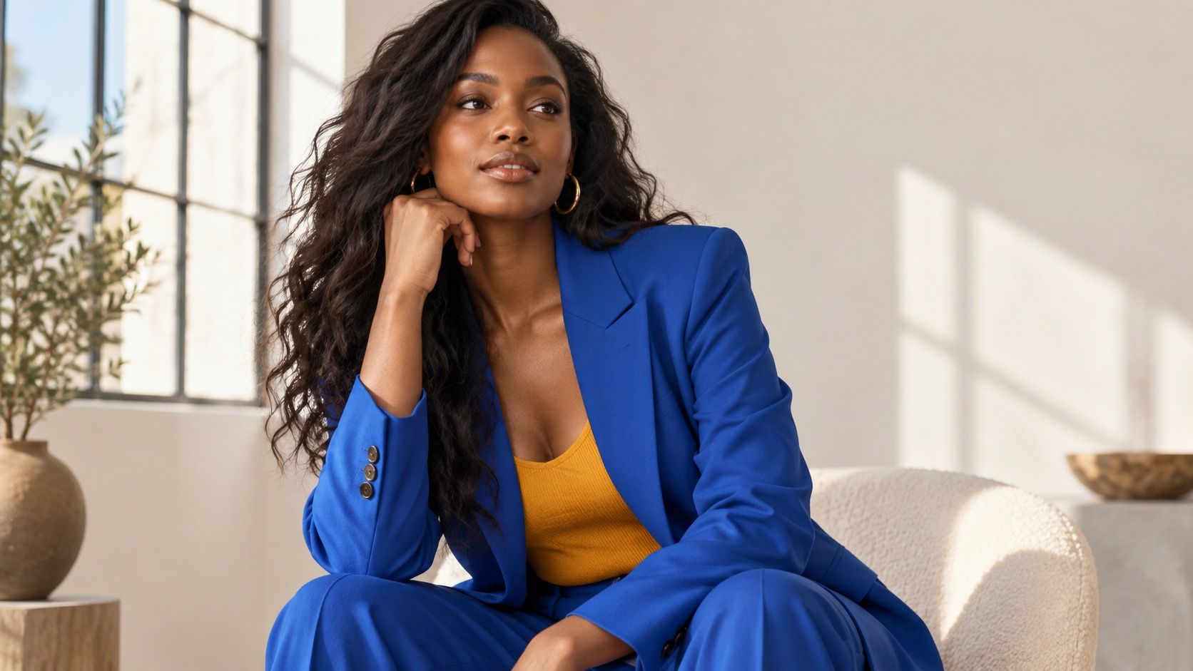
Depth matters just as much. Light olive skin may look especially good in medium values such as softened navy, sage and medium rose, while deeper olive skin can often carry cream, saturated cobalt or rich chocolate with greater ease. Test black against charcoal and dark navy rather than assuming black is neutral. If black makes the face look drained, a less absolute dark can give the same polish without the hard edge.
Choose balanced colors before dramatic statement shades
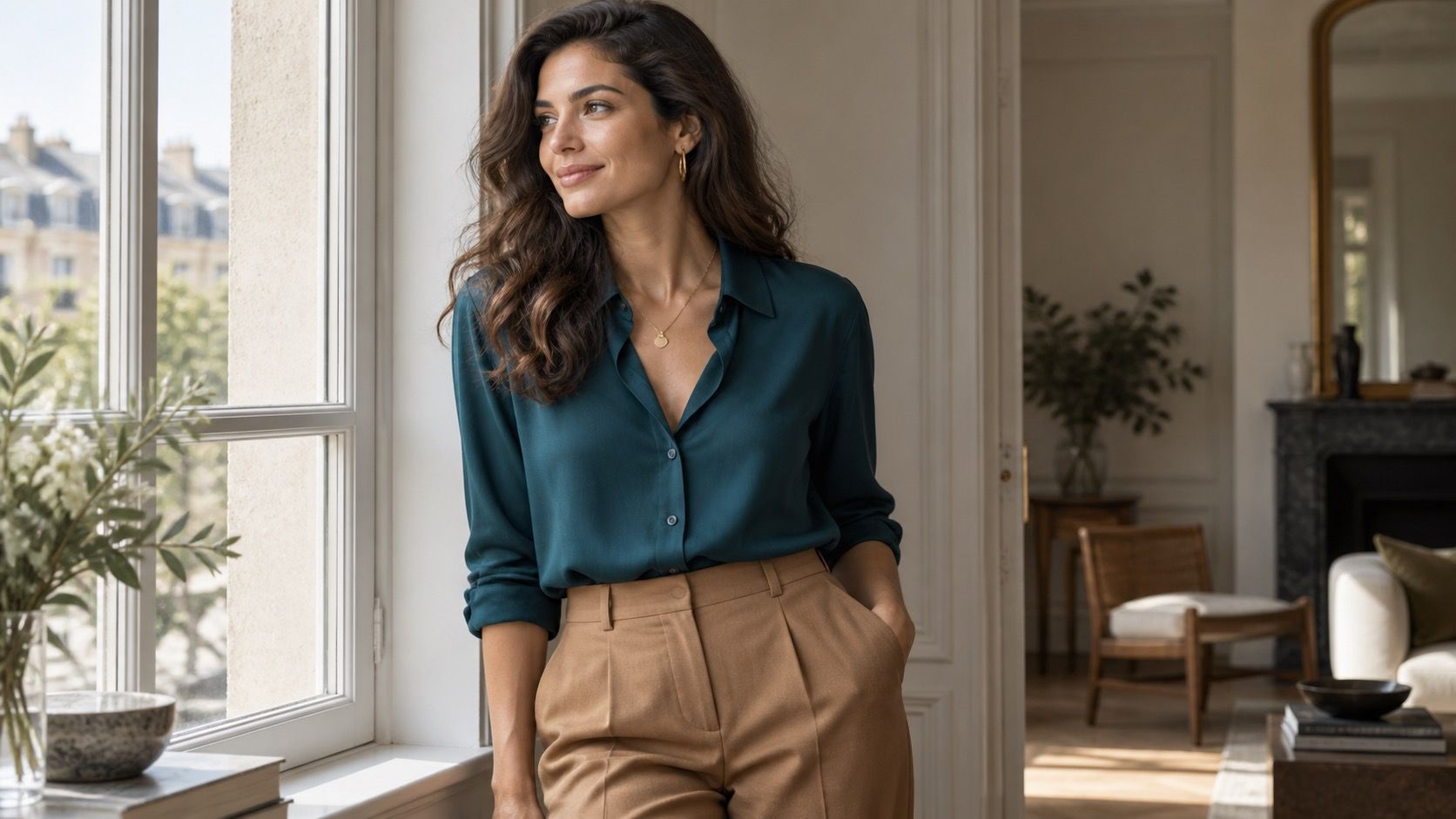
Muted greens are often easier than acid or yellow greens because they echo the complexity of olive skin without turning the whole look green. Think eucalyptus, deep sage, moss or forest rather than fluorescent lime. Berry tones, mulberry, dusty plum and blue-reds can provide contrast without the orange pull of some corals. These are not magic colors; they are sensible starting points because they contain enough depth or coolness to sit beside many olive complexions.
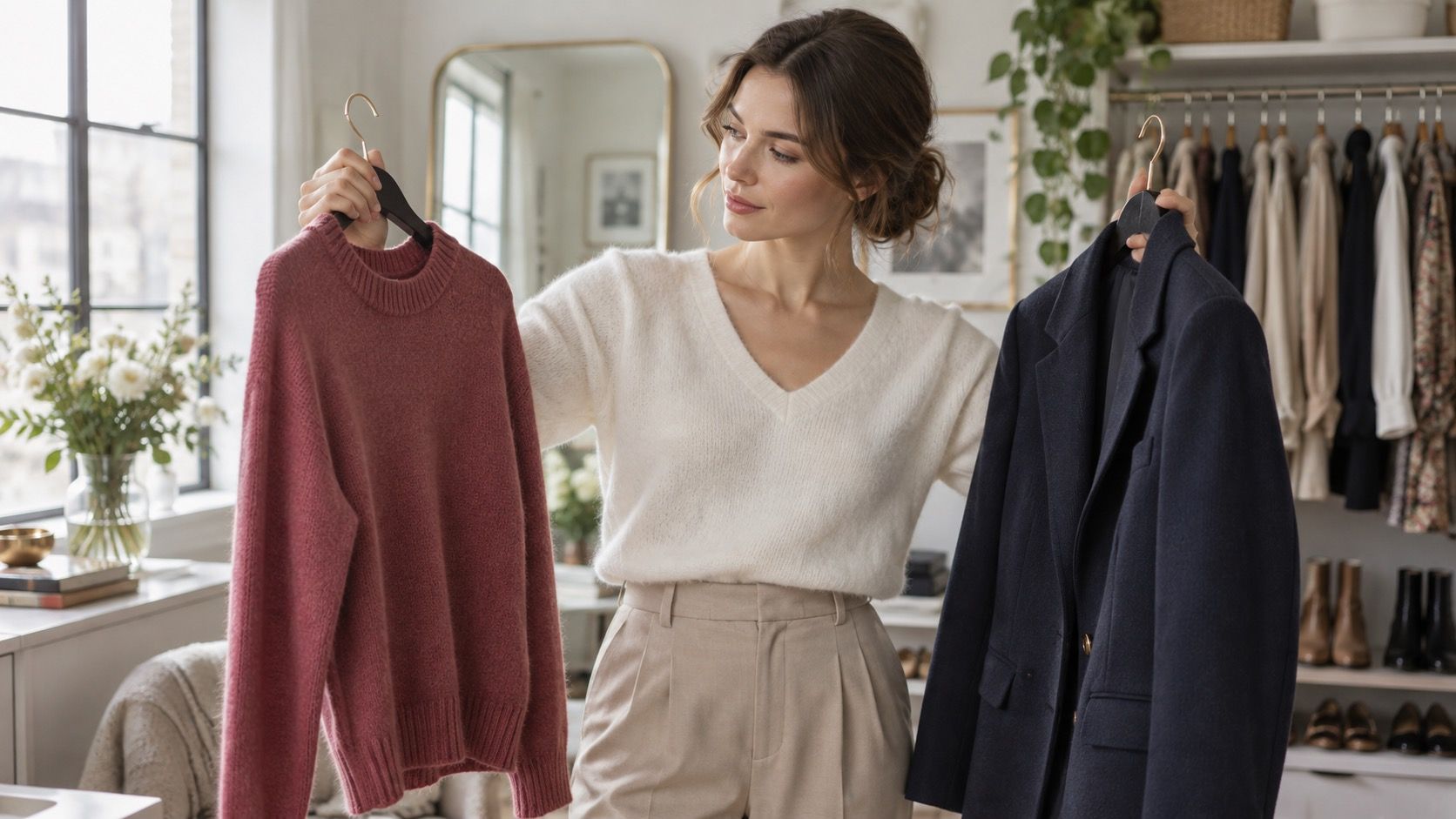
Try them in a normal outfit before declaring victory. Pair a berry crewneck with your usual denim, then wear a moss shirt with cream trousers and see which feels more like you in daylight. A flattering color that only works with one special skirt is not necessarily a core wardrobe color. A shade that works under a coat, with jeans and with a work trouser deserves more space. The most helpful olive skin color palette includes reliable combinations, not only isolated swatches.
| Color family | First version to test | Compare it with |
|---|---|---|
| Green | Sage, moss or deep forest | Lime or yellow olive |
| Red and pink | Berry, mulberry or blue-red | Orange coral or tomato |
| Light neutral | Soft cream or stone | Stark white and yellow beige |
| Dark neutral | Deep navy, espresso or charcoal | True black |
Choose whites, beiges and browns with more care
Light neutrals are where olive skin often gets misread. Optic white can create clean contrast, but if it makes the face look gray, try soft white, oyster or a cooler cream. Conversely, a rich ivory may be excellent on a warm olive tone and unhelpful on a cool olive one. Photograph the choices in the same daylight if the mirror makes them hard to separate. Tiny differences in white are easier to judge when you can look away and return later.
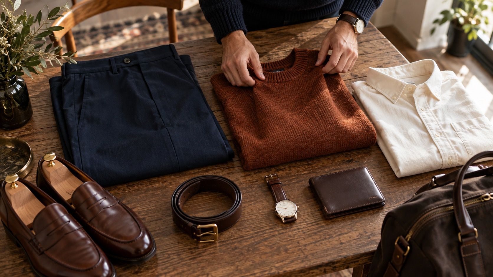
For beige and brown, notice the yellow content. Sand, camel and tobacco can be beautiful when they connect with your natural warmth, but a pale yellow-beige can look oddly disconnected if the complexion leans cool. Taupe, cocoa, mushroom and espresso are useful alternatives because they bring more gray or depth. Put a brown next to a berry scarf or a blue top; the pairing often reveals whether the brown is supporting the face or quietly dulling it.
Build outfit combinations that give the colors a job
For an uncomplicated everyday combination, try a soft cream top, olive or medium-wash denim, and a dark brown shoe. If cream is too warm or too light, switch to a blue-white tee and keep the rest unchanged. Another dependable experiment is a muted berry knit with charcoal trousers, or a sage shirt with deep navy jeans. These combinations give one color close to the face and one stable neutral beneath it, which makes the test easier to read.
Keep bright accents for the role they actually handle well. A vivid orange bag may be delightful even if orange near the face is difficult; a cool olive skin tone color palette may include rich cobalt earrings while a cobalt blouse feels too intense. Style is more flexible when each color has a sensible distance from the face. Use the mirror, daylight and repeated outfits to find those roles, then let the wardrobe grow from what remains convincing after a normal day.
Test colors against the outerwear you wear most. A cream tee may be excellent alone but less useful if your usual coat turns the whole outfit too warm; a berry scarf can make a familiar navy coat feel newly balanced. These ordinary combinations decide whether a shade becomes a regular choice or remains a very pretty exception.
Repeat this check.