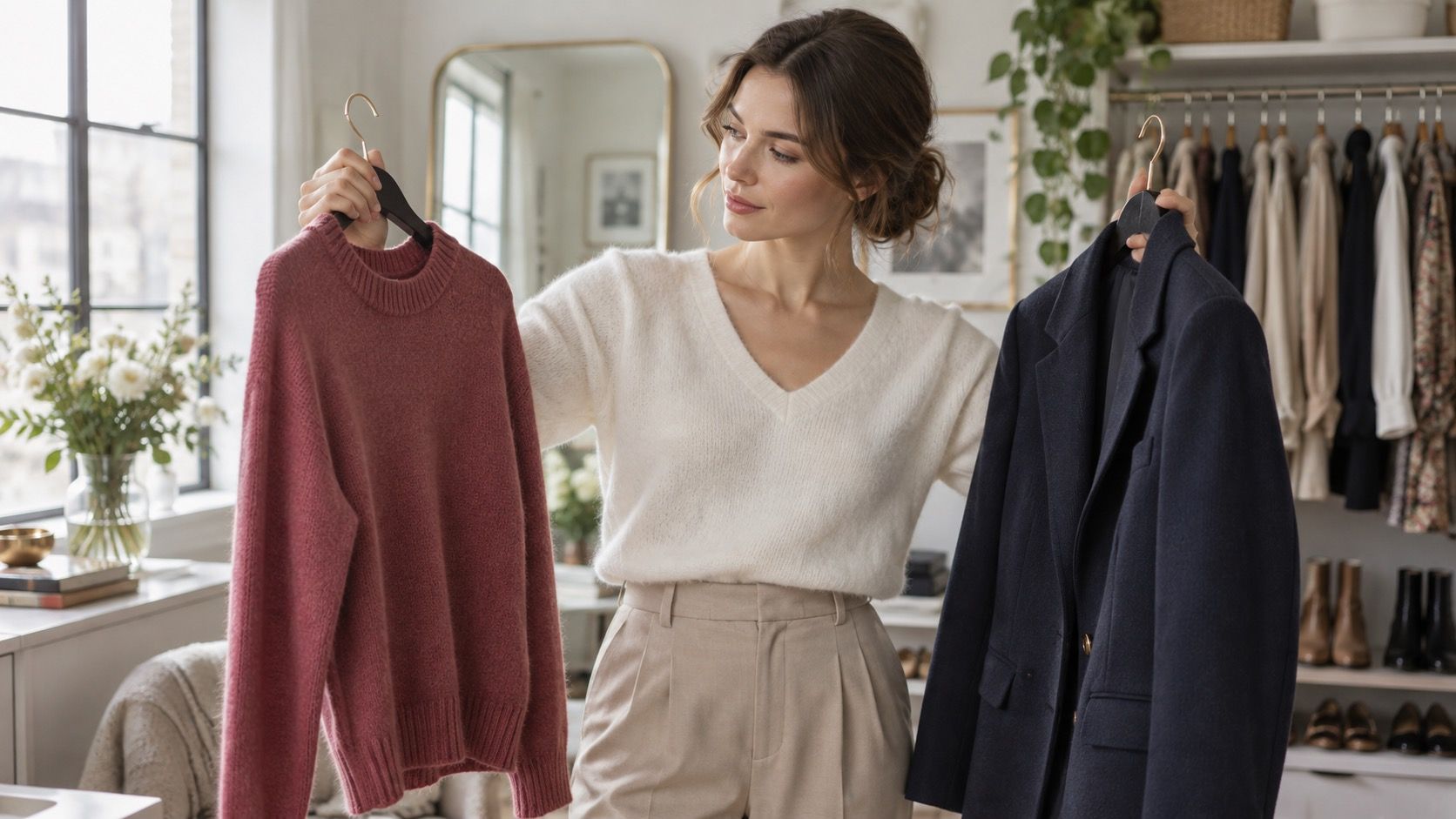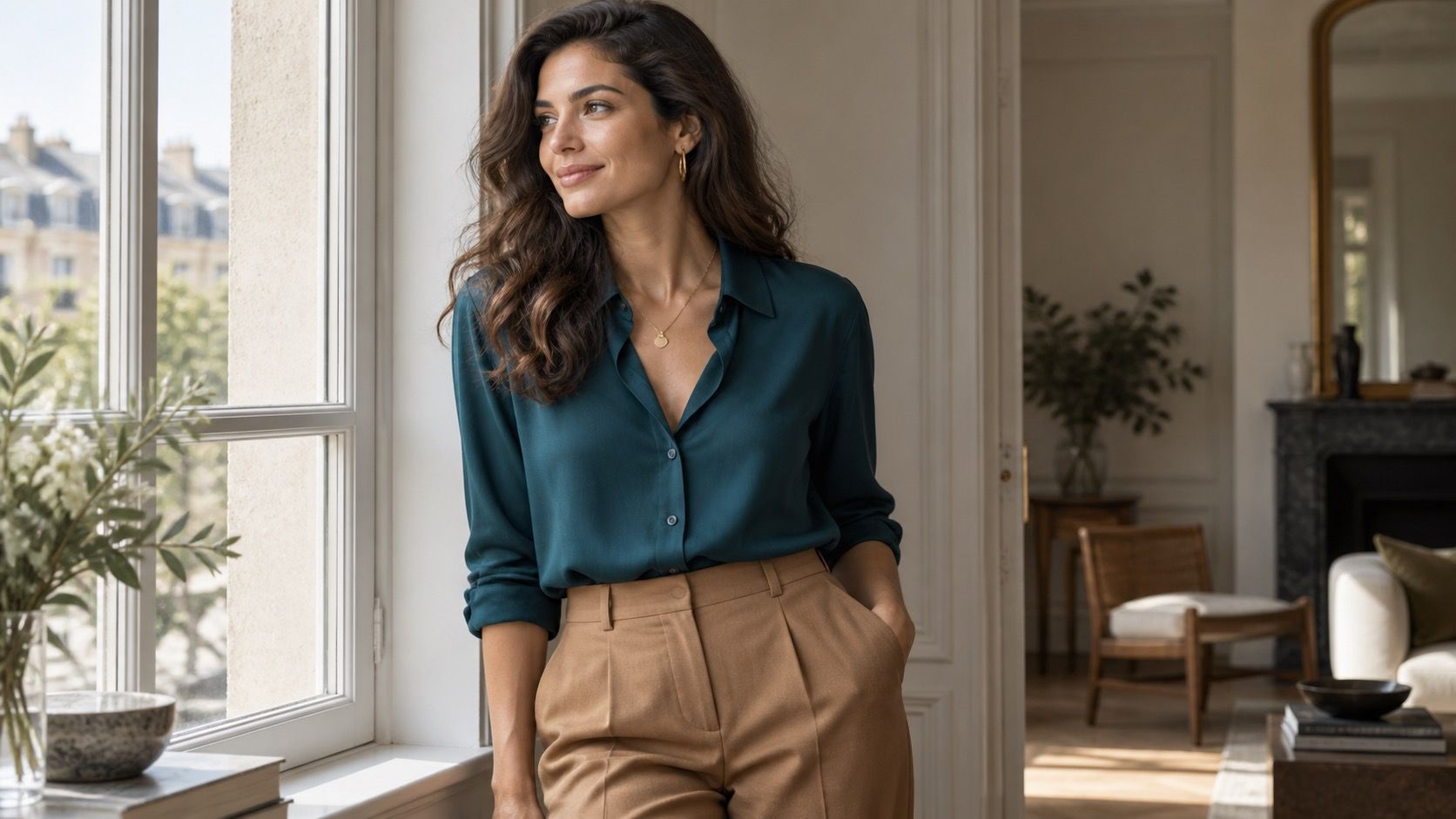
Neutral undertones get described as the easy setting in color analysis, which is partly true and partly how wardrobes end up full of beige things that never leave the hanger. The advantage is range, not immunity from bad color. A neutral complexion can borrow from warm and cool palettes, but the shade, depth, and fabric still decide whether an outfit looks calm or merely tired.
Start with the colors already doing the work
The simplest way to find neutral undertone colors to wear is not a wrist-vein quiz. Pull out the tops that make your face look awake at 8 a.m., then look for a pattern. It may be a soft white shirt rather than stark optic white, a medium navy knit rather than inky black, or a muted olive tee that works even on a no-makeup day. These repeat winners are more useful than one dramatic color that photographs well once.
Build the base around flexible neutrals
Neutral undertone does not mean your skin is visually blank. Hair color, eye color, natural contrast, and tanning all affect the result. Someone with dark brows and medium brown hair can carry charcoal and rich navy easily; someone with low contrast may find the same colors heavy near the face. Test tops in daylight, away from a colored changing-room wall, and notice your under-eyes and lip color before judging the garment itself.
The best colors for neutral skin tone usually begin with softened neutrals. Taupe, mushroom, soft white, stone, mid-gray, olive, denim blue, and navy mix without forcing every outfit into one temperature. They are useful because they can take either a warm coral scarf or a cool berry bag without looking as if two wardrobes collided in the hallway.
Choose the version that echoes your own contrast. Soft white is often easier than bright white for fair or low-contrast coloring, while deep navy gives a clearer frame to medium and dark features. Camel can be excellent, but a very yellow camel next to a pinker neutral complexion may look borrowed from somebody else. A gray-beige taupe is the quieter substitute and earns its keep with jeans, black trousers, and gold or silver hardware.
| Base color | Works best when | Useful partner colors |
|---|---|---|
| Soft white | You need light near the face without sharp contrast | Denim, dusty rose, olive |
| Taupe or mushroom | You want a polished neutral that is neither icy nor yellow | Navy, berry, muted coral |
| Medium navy | Black feels severe but pale gray feels weak | Soft white, olive, cool pink |
| Olive | You want color that behaves like a neutral | Cream, rust, dusty blue |
Borrow warm and cool accents on purpose
A neutral palette earns its flexibility when accents are chosen by intensity, not by a rule that says warm or cool only. Dusty rose, muted teal, soft cobalt, terracotta, burgundy, sage, and faded coral can all work. The safer first move is a muted or medium version: a washed coral sweater rather than fluorescent orange, a wine-red blouse rather than a blue-red satin dress, or a cloudy teal shirt instead of a jewel-toned turquoise one.
Use the fitting room test on the full outfit. A cool pink blouse may be flattering with faded denim and silver earrings, then look oddly sugary with a yellow-beige skirt. Likewise, a warm rust jumper can look sophisticated with olive trousers and brown leather, but too orange beside bright white. The color has not betrayed you; the neighboring colors changed its temperature.
Do not confuse flattering with dramatic
There is a common trap in advice for neutral skin tone colors to wear: choosing the boldest thing that produces contrast and calling it a win. Pure black, hot fuchsia, bright citrus, and icy pastels can create a strong image, especially under store lighting. In ordinary daylight they may draw attention to themselves first and leave the face looking gray, red, or washed out.
That does not ban them. It changes their job. Put black in trousers, boots, a belt, or a structured bag when it makes your face look hard. Use vivid fuchsia in a print with cream or navy, or wear it below the waist. For a wedding guest dress or an evening event, a saturated color can be deliberate. The everyday test is simpler: would you choose this top for a video call when you have had little sleep? If not, it probably is not a core color.
Make five reliable outfits from the same palette
For a workday, try a soft white shirt, medium navy trousers, and taupe loafers; it looks clean without the severity of white-and-black. For errands, combine a faded denim shirt with olive chinos and a mushroom tee. The tones are close enough to feel considered but not so matched that they become a uniform.
A dinner outfit can start with a dusty rose top, dark jeans, and either silver or warm gold jewelry; neutral undertones often have room for both metals, so let the outfit decide. For a casual dress, choose muted teal or soft burgundy and keep the shoe a quiet tan, gray, or navy. On a cold day, a camel coat works over a navy knit if the camel is muted; if it reads yellow, use a stone or taupe coat instead.
These formulas are not a color prison. They are a way to notice whether the clothes support one another. Once the base is stable, adding a brighter scarf, lipstick, shoe, or bag becomes low-risk. That is the useful part of a neutral undertone: not permission to buy every shade, but enough range to build a wardrobe that adapts to the life you actually dress for.
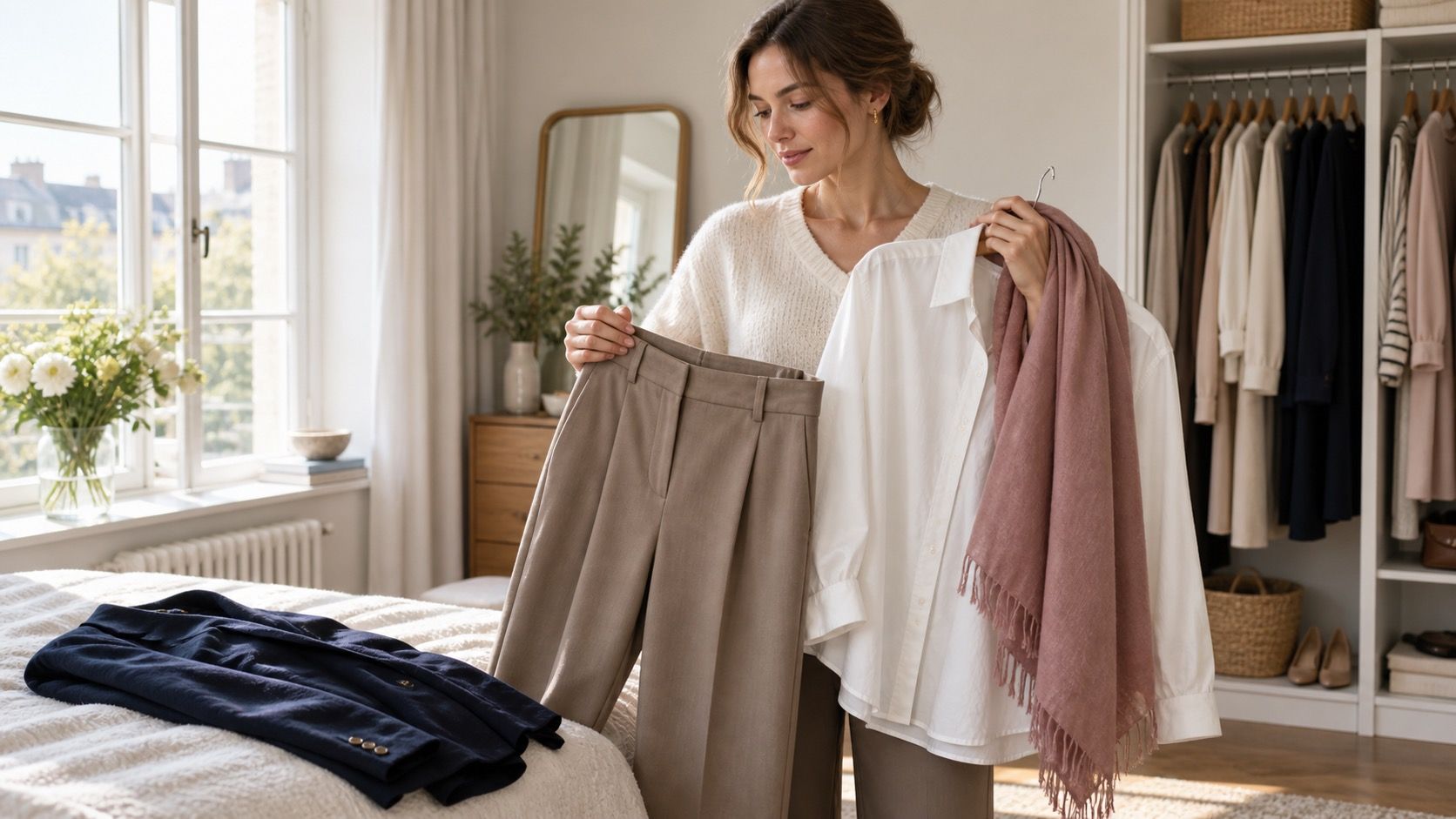
Shopping becomes easier when you compare colors in a small group rather than auditioning each one alone. Take a taupe, navy, and soft-white piece into the fitting room, then add one warm and one cool accent. A muted coral might bring life to the neutral base, while a dusty lavender could be better with navy. This five-piece test shows whether the item expands the wardrobe or merely looks pleasant under the shop lights. It is also a good way to decide whether a color belongs near the face, below the waist, or only in accessories.
Keep the final test practical: wash the item, wear it with the shoes you own, and take one photo outdoors. A color that still feels easy after that earns a place in the rotation.