High versus low contrast outfits become useful once they stop sounding like a verdict on your face. Contrast is simply the visible difference between light and dark, muted and clear, large and small. You can use it to make a white shirt and black trousers feel crisp, or lower it when you want a soft outfit that does not arrive in the room before you do.
What contrast means in clothing
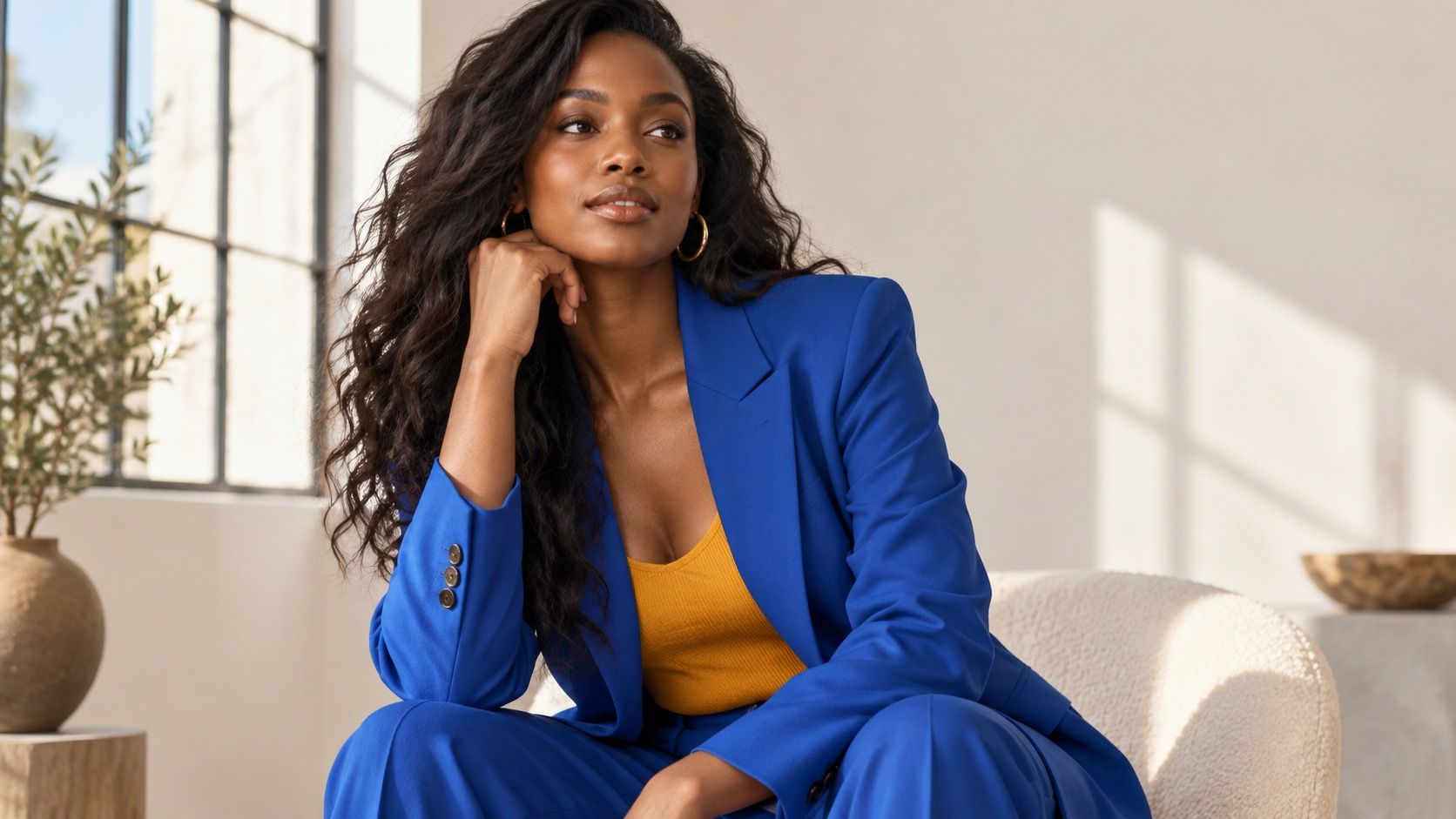
Value contrast is the easiest kind to see. Black and white sit far apart; charcoal and medium gray sit close together. Color contrast adds another layer: cobalt beside orange has more tension than navy beside teal. Personal contrast is the pattern you notice between hair color, skin tone, eyes, brows, and features. It can shift with a tan, a change of hair color, glasses, makeup, or even the light in a photograph.
Test your own contrast with simple photos
That is why a high contrast vs low contrast face label should be treated as a styling clue, not a diagnosis. A person with dark hair may enjoy tonal beige one day and a graphic black-and-white dress the next. The useful question is whether the clothing gives the face enough definition for the mood and setting. A monochrome outfit can be quiet or strong depending on the values used.
For a practical high or low contrast face test, take three unfiltered photos in daylight with a plain background. Wear a low-contrast outfit such as soft gray with navy, a medium-contrast outfit such as denim with white, and a high-contrast combination such as black with white. Keep pose, hair, and distance the same. Comparing screenshots is more reliable than trusting a changing-room mirror under yellow bulbs.
Look first at the face, not whether you like the clothes. In one photo, do your features appear clearer and more rested? In another, does the outfit arrive before you do? Then repeat with a colored scarf near the face. Hair color and brow depth can change the balance substantially, and glasses often add contrast on their own. A what is my contrast level quiz can start the experiment, but your own images are the better evidence.
| Contrast level | Everyday formula | Useful adjustment |
|---|---|---|
| Low | Soft navy, blue-gray, medium denim | Add one darker shoe or defined earring if it feels vague. |
| Medium | Dark denim, white tee, colored cardigan | Repeat one color in a belt, shoe, or bag. |
| High | Black, white, cobalt, or strong red | Keep the silhouette simple so contrast has room. |
| Changing the dial | Tonal base with one sharp accent | Place the accent near the face for the biggest effect. |
Outfit formulas for low contrast days
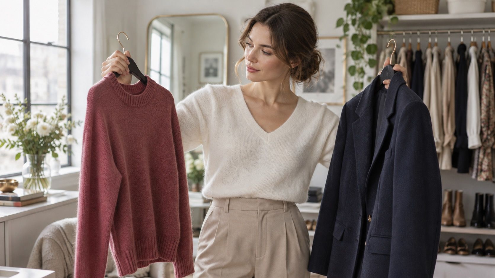
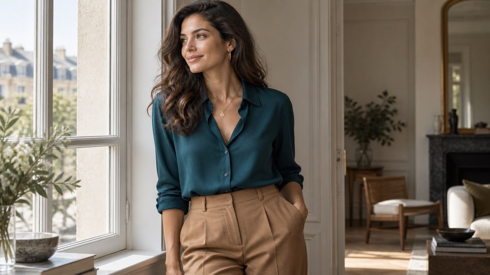
Low contrast dressing relies on related values and colors. Think stone trousers with a warm gray knit, navy denim with a blue shirt, or olive with muted cream. These combinations can look refined rather than washed out when texture is present: denim, ribbing, wool, and suede create enough separation without introducing a hard black-and-white line.
A common mistake is to use every piece at exactly the same lightness. If the outfit becomes foggy in a photo, add a medium-dark belt, boot, or jacket. Keep the change small. A dark brown shoe under an oat-toned trouser gives the eye a base; a bright red bag would raise both color and value contrast at once. Low contrast works best when it feels softly edited, not unfinished.
Outfit formulas for high contrast days
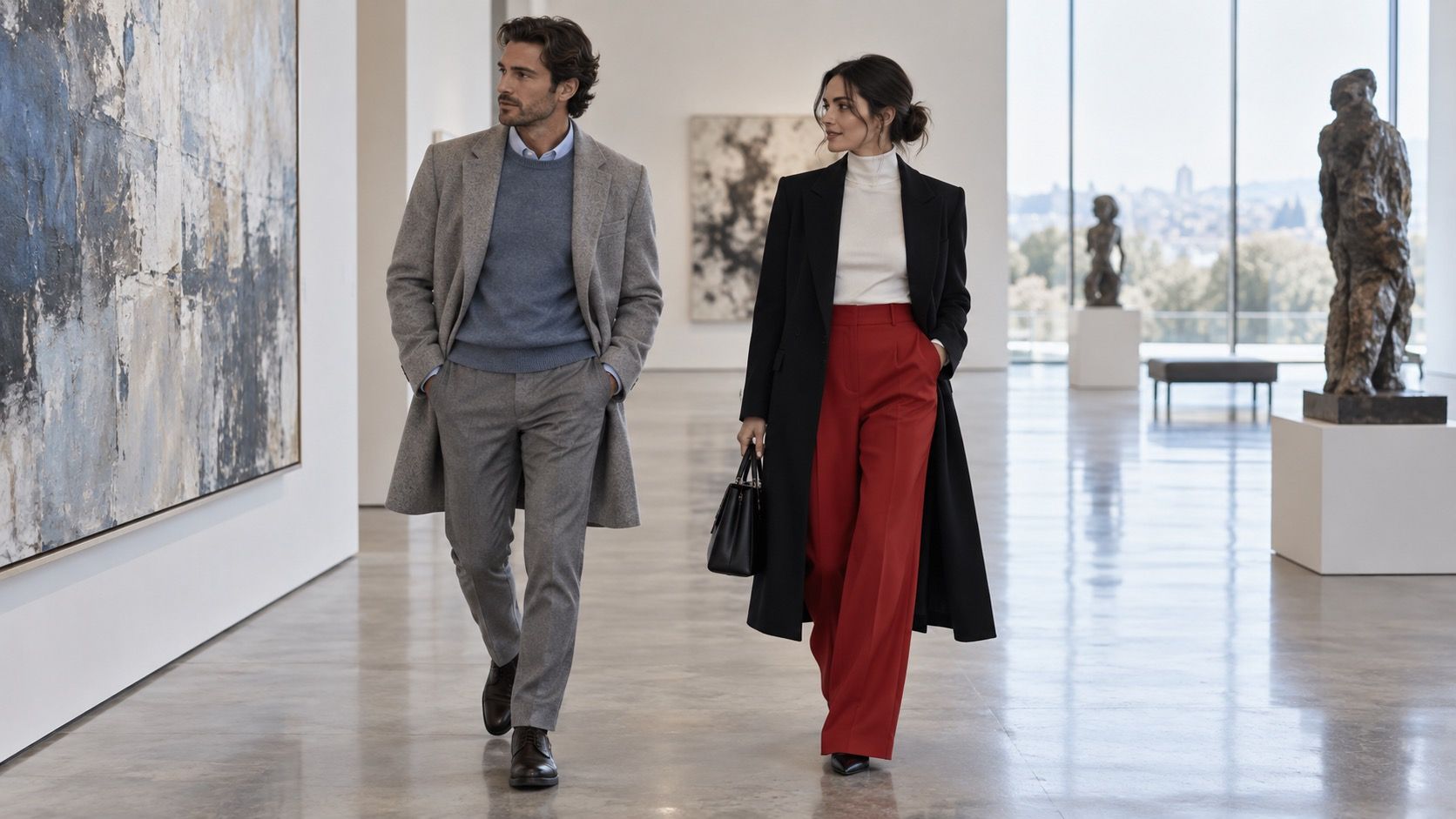
High contrast is easiest when the garment shapes are clean. Black trousers, a white shirt, and a black loafer can handle a bright lip or silver earring because the main structure is already clear. Navy with white offers a less severe version. Cobalt with black is another reliable formula when the cobalt is the only saturated color and the fabrics are not overly shiny.
Control the quantity of contrast. A black-and-white check, sharp red bag, white trainer, graphic frame, and bold lipstick can all be attractive individually, but together they create several focal points. Pick one main contrast: the top and trousers, the print, or the accessory. If the outfit feels too hard near the face, replace pure white with pale gray or change black to charcoal while keeping the same silhouette.
Use print and accessories to fine-tune the result
Print scale changes contrast even when the colors stay constant. Fine dots in navy and cream feel quieter than a wide black-and-white stripe. Large checks create a stronger boundary from across a room, so they work best with solid companions. If you are unsure, put the print farther from the face in a skirt or shoe, then compare it with a printed scarf. Placement often matters more than the pattern itself.
Accessories are the smallest and most forgiving dial. Silver hoops, dark frames, a defined belt, or a bright shoe can raise an otherwise tonal outfit. A soft scarf, matte bag, or low-contrast trainer can reduce an outfit that feels theatrical. Build from what the day asks for: a client meeting may benefit from a clear jacket-and-shirt contrast, while a long travel day can feel better in tonal layers. Contrast is not a score to maximize; it is a way to decide where you want the eye to land.
Hair, glasses, and makeup are part of the outfit picture, so re-test contrast after a visible change. Dark frames create a line around the eyes and may mean a black-and-white shirt needs fewer additional strong details. A new lighter hair color can make the same charcoal jacket feel heavier than it did last year; a soft scarf or medium-blue top can provide a more comfortable bridge. The point is not to chase a fixed category every morning. Notice what has changed around the face, then decide whether the clothes should echo that definition or give it some breathing room. A photo in ordinary daylight is more honest than a close-up mirror inspection.
Contrast also has a practical role in a wardrobe that needs to mix easily. Keep one low-contrast formula, one medium formula, and one high-contrast formula built around the same trousers or jeans. For example, dark denim with a blue-gray knit is quiet; the same denim with a white shirt and olive cardigan is medium; with a white shirt and black jacket it becomes high. The pieces remain useful because the difference comes from value and placement, not from buying three separate personalities. When an outfit seems flat, add one defined edge near the face. When it seems loud, exchange either the lightest or darkest piece for a middle value before removing all the interest.