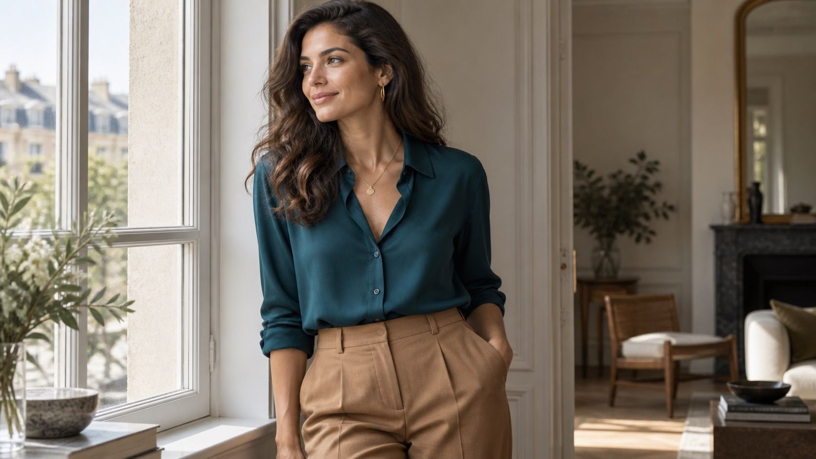
Blue is the usual headline for a cool undertone, and it is a useful one, but a wardrobe made of navy sweaters and denim soon feels like a uniform with better lighting. Cool coloring has more options: berry, blue-red, slate, cool pink, charcoal, pine, and clear white can all be practical. The trick is seeing whether a color carries blue, gray, or pink beneath the surface rather than trusting its label on a rack.
Read cool color signals without turning it into a diagnosis
A cool undertone is about the cast beneath the skin, not a verdict based on hair color, ancestry, or a single online test. You may notice that silver looks integrated, blue-red lipstick looks cleaner than orange-red, or rose pink is easier than peach. Those are clues, not paperwork. Daylight and the color near your face matter more than the inside label that says mauve, berry, or wine.
Choose the cool neutrals that will actually mix
Try two similar tops with no makeup if possible: a raspberry pink beside a coral pink, or a true red beside tomato red. A flattering cool shade usually lets the skin keep some clarity. If a top makes redness look louder, teeth look yellow, or dark circles show up before you do, move it away from the face. It can still work as a skirt, trouser, bag, or shoe.
The most useful colors for cool skin tones are often the quiet ones. Soft navy, charcoal, slate, cool taupe, blue-gray, ink, and crisp white form a better daily foundation than black alone. Black can look excellent on high-contrast coloring, but it is not compulsory. On softer features, charcoal or ink gives definition while leaving room for the face to remain visible.
Pay attention to the white in shirts and knitwear. Optic white can be striking with clear, high-contrast features, especially next to navy or berry. A blue-white or soft white is calmer for low contrast. Cream is not automatically wrong, but buttery or yellow cream can make a cool palette look slightly off, particularly when paired with silver jewelry or icy blue denim. A cool ecru or pale gray works more often.
| Color family | Easy wardrobe version | When to use it |
|---|---|---|
| Dark neutral | Ink navy or charcoal | Coats, trousers, knitwear, office outfits |
| Light neutral | Blue-white or pale gray | Shirts, tees, layers near the face |
| Pink and berry | Rose, raspberry, cranberry | Blouses, dresses, a strong but wearable accent |
| Red and green | True red, blue-red, deep pine | Evening pieces, knitwear, scarves and prints |
Use blues, reds, and pinks with enough restraint
Blue is broad territory. Soft denim, French navy, cornflower, periwinkle, cobalt, and blue-gray do different jobs. A pale blue shirt is useful for work because it reads polished beside charcoal or navy. Cobalt brings energy but can overpower soft features, so it is often better as a knit, bag, or shoe than as a large satin dress. The closer a blue is to neon, the more it asks of the rest of the face.
For red, look for a blue base: true red, cherry, cranberry, or burgundy generally sit more comfortably than orange-red. Pair a cranberry knit with dark denim and gray boots for an everyday outfit, or use a true-red blouse under a navy blazer when you want more presence. Cool pinks range from dusty rose to raspberry. The dusty shades suit low contrast; raspberry and magenta suit clear coloring when the fabric is matte rather than shiny.
Let jewelry and prints settle the temperature
Silver, platinum-colored metal, white gold, and pewter often harmonize easily with a cool undertone, but this is not an oath against gold. Pale champagne gold or mixed metal can work when the garment itself is cool and the contrast stays controlled. A bright yellow-gold necklace against a buttery cream sweater is where the combination can start competing with the face.
Prints are a useful shortcut because they mix temperature for you. Look for navy-and-white stripes, gray florals with berry accents, black-and-cream checks that lean cool, or a muted plaid containing slate and pink. Hold the print close to your face before buying. If one color in it looks wrong, that wrong color may be the only thing people notice at conversational distance.
Match contrast to your features, not to a seasonal chart
Cool skin tone colors to wear female readers often ask for a single palette, but contrast changes the answer. Low-contrast coloring usually looks coherent in adjacent values: soft blue with blue-gray, dusty rose with charcoal, pale denim with soft navy. A black top with stark white trousers may feel louder than the person wearing it. Add depth through texture instead: brushed wool, ribbed knit, washed denim, or suede.
High-contrast features can use clearer edges. A white shirt under a navy jacket, a berry dress with black tights, or true red with charcoal can look intentional rather than severe. The deciding detail is not a color season label; it is whether your eyes and hair still register before the outfit does. Keep a few test photos in daylight. They reveal more than a changing-room mirror and save a great many almost-right purchases.
Cool colors become far less limiting once the wardrobe has slate, navy, gray, berry, and one clean light neutral at its core. Then blue is no longer the only answer. It is simply one member of a palette that can look sharp, soft, casual, or formal without making every outfit feel like a lesson in color theory.
When a shade is close but not quite right, change the fabric before abandoning it. A warm-looking color in faded denim, brushed cotton, or a small print often feels less insistent than the same color in glossy satin. Cool palettes also benefit from a little softness around the neckline: a blue-gray collar, a charcoal cardigan, or a berry scarf can make a neutral outfit feel finished. The most useful wardrobe does not contain every flattering color; it contains colors that still work together on a rushed Tuesday morning.
One final check helps: photograph the outfit outdoors and in a room with warm light. A good cool shade stays balanced in both places instead of depending on one flattering mirror.