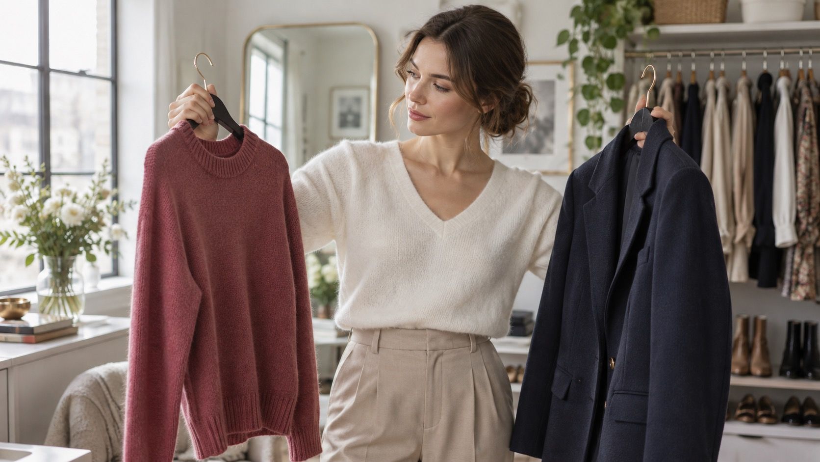
A color test for clothes is most helpful when it stops pretending to be a personality quiz. The goal is not to receive a ceremonial label; it is to notice which tops make your face look clear in the light you actually live in, then turn that observation into calmer purchases. A window, a mirror, several plain tops and a phone are enough to begin.
Set up a test that answers a real wardrobe question
Choose a day with indirect daylight and a spot near a window. Remove strongly tinted glasses, turn off a warm lamp if possible, and keep makeup light or repeat the test on a makeup-free morning. You need comparison, not perfection. Gather tops, scarves or pillowcases in pairs that are easy to confuse: white and cream, black and navy, peach and rose, camel and cool taupe. Lay them out before you start so the test does not become a hunt through a laundry chair.
Compare warm and cool light neutrals first
Use the same simple posture for every color: fabric just below the chin, hair moved away from the jaw, face relaxed. Ask whether your eyes look more awake, whether shadows around the nose and mouth deepen, and whether the first thing you see is the person or the fabric. A useful test is quiet. If you need to squint, add lipstick, or explain why the color is clever, it may not be doing the easy work you want from an everyday top.
White versus cream is a surprisingly effective starting point because both colors throw light onto the face. An optic white can make some complexions look fresh and defined; on others it emphasizes redness or makes the skin seem gray beside it. Cream may soften that effect, but a very yellow cream can also look separate from the face. Hold one option after the other rather than deciding from memory. Small differences become clearer when the fabrics take turns next to the same skin.
Repeat the exercise with jewelry or metal buttons. Silver-colored metal, pewter, soft gold and bright yellow gold create different reflections, especially near the ears and collarbone. This does not diagnose an undertone with scientific certainty. It simply gives you useful evidence: perhaps cool metals and blue-white shirts are easy wins, or perhaps muted gold and ivory make more sense. Record both the winner and the close second; clothes rarely operate in absolute categories.
Notice brightness before trying to name a season
Many people jump from one awkward coral top to a full seasonal-color theory. Start with brightness instead. Compare a clear red with brick red, a vivid teal with smoky teal, or bright pink with a muted raspberry. If the clear version pulls attention away from your face, you may prefer colors with a little gray or depth. If the smoky version makes you look tired, a cleaner, brighter color may be more useful. This distinction is practical even if you never use a seasonal name.
Take phone photos from the same distance and place them side by side later. Cameras are imperfect, especially in mixed light, but they remove the temptation to adjust your opinion as you stare. Avoid portrait mode and filters; they are very enthusiastic assistants and not objective ones. Look for repeated patterns across several colors, not one flattering accident. The results can become your own color chart for clothes: a short list of light, medium, dark, bright and muted options that have earned their place.
| Comparison | What to watch | What the result may suggest |
|---|---|---|
| White vs cream | Redness, eye definition, jawline | Preferred light-neutral temperature |
| Black vs navy | Under-eye shadows and feature contrast | Best dark neutral depth |
| Clear red vs brick red | Whether color arrives before your face | Preferred saturation level |
| Silver vs soft gold | Evenness around cheeks and lips | A helpful metal direction, not a rule |
Test colors with actual outfits, not floating swatches
A square of fabric cannot show how a color behaves with your trousers, hair, glasses and usual coat. Put the stronger candidates into complete outfits. Wear the navy top with your common denim, then with black trousers; wear the berry knit under the jacket you rely on for work. Sometimes a top that is good near the face becomes difficult because it clashes with every bottom you own. That is not a failure of the color; it is a reason to buy it only if the outfit problem has a realistic solution.
Pay attention to fabric finish and scale. A matte forest-green knit is not the same proposition as a glossy forest-green blouse, and a tiny print can read differently from a large block of color. If a shade works only when it is a scarf or bag, keep it in that lane. If it works in a sweatshirt, shirt and coat, it belongs in the core wardrobe. This is more useful than searching for a free what colour clothes suit me quiz, because it produces choices you can repeat with the clothes you already wear.
Turn the results into a shopping note you will use
Do not build a giant palette after one afternoon. Make a small note with three headings: reliable near-face colors, colors to compare before buying, and colors that work better away from the face. Include plain descriptions such as “soft white, not optic white,” “deep blue instead of black,” or “muted berry, avoid orange coral.” That wording is fast to check in a shop and less confusing than trying to recall a complicated online diagram.
Revisit the test when your hair color changes, when the season changes your skin depth, or when you discover a fabric that behaves differently. The point is not to narrow your wardrobe into five permitted shades. It is to make a color test for clothes into a repeatable filter, so new pieces have a better chance of joining outfits you already enjoy.
Use the same note when shopping online. If a listing calls something stone, soft white, or berry, compare the product image with a garment that has already passed your daylight test, then check the return policy before treating the screen as evidence. A careful color choice is simply cheaper than a closet full of almost-right tops.