A color chart for clothes is useful when it helps with the moment in front of the wardrobe: the trousers are fine, the top is fine, and together they somehow look unfinished. It is not a set of laws. It is a way to see temperature, depth, and saturation before buying another item to solve a problem that two existing pieces could solve.
Read a clothing color chart without overthinking it
Start with the color wheel, then ignore most of its drama. Colors beside one another are analogous; colors opposite each other are complementary. The wheel does not account for fabric, lighting, proportion, or your practical need to wear the same coat three times a week. It does, however, show why an olive skirt and a moss knit feel calmer together than an olive skirt and a bright blue top.
Build analogous outfits for easy coordination
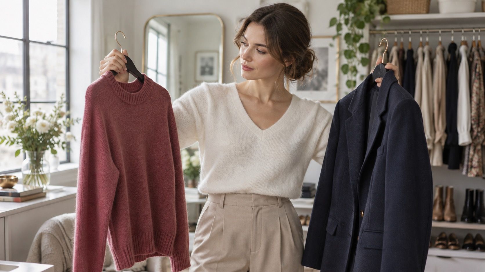
Value matters as much as hue. Navy and burgundy are different colors but close in depth, so they make a quiet combination. White and black have high value contrast even with no color theory involved. Lay the pieces on a bed and take one step back. If your eye lands on five separate points, reduce either the number of colors or the difference in their brightness.
Analogous outfits are the dependable choice for a packed morning because their colors already share a direction. Blue, blue-green, and green can become navy trousers, a teal sweater, and a forest-green scarf. Rust, terracotta, and warm brown work the same way. One item should be the clearest or darkest; otherwise the outfit can become a pleasant but vague blur.
Use neutral basics to keep the combination wearable. A soft blue shirt, dark teal cardigan, and medium-wash jeans have enough relationship without looking matched. If all three garments are equally bright, switch one for charcoal or cream. The aim is coordination, not a paint-swatch display. This is especially useful for a colour palette for skin tone when you want a few familiar shades to work together rather than chasing a perfect category.
| Color relationship | Simple outfit | Adjustment when it feels wrong |
|---|---|---|
| Analogous | Navy, teal, and denim | Add white or charcoal if the tones merge together. |
| Complementary | Olive with muted red | Let one color be smaller: shoes, knit, or bag. |
| High value contrast | Black with white | Use gray or navy as a bridge when it feels severe. |
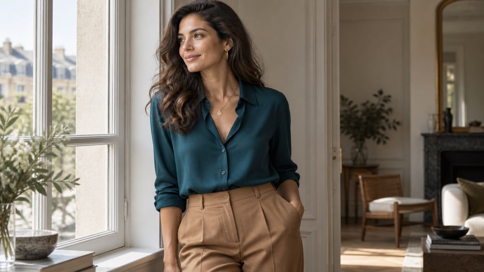
| Tonal | Camel, tobacco, and chocolate | Change texture so the outfit does not look flat. |
Use complementary contrast in a wearable way
Complementary colors have energy, which is why they are easy to overuse. A red knit and green trousers may be technically opposite, but their intensity can make the outfit read more festive than intended. A better everyday approach is to let one color lead and make the other a controlled reply: deep green trousers with a small berry bag, or navy with a rust scarf.
Muted versions are often easier. Mustard beside dark blue, plum beside olive, or coral beside denim can still create contrast without shouting. Check saturation before you check the wheel. If one piece is dusty and the other is neon-bright, their mismatch may be the problem, not the colors themselves. Shoes and accessories are useful testing ground because they change the balance without committing the whole outfit.
Let neutrals do the connecting work
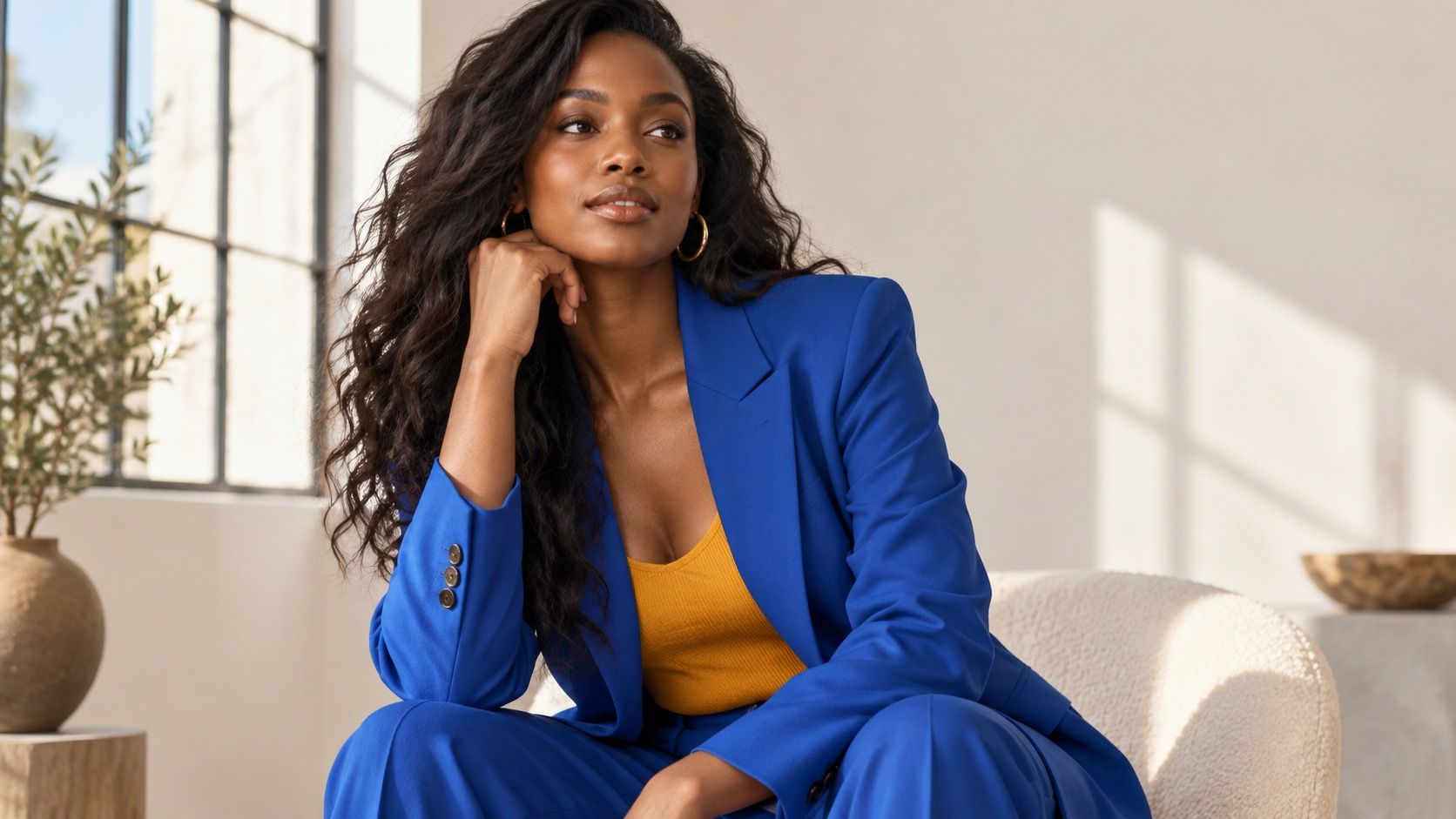
Neutral basics are not the boring part of a clothing palette; they are the punctuation. Black, navy, charcoal, cream, brown, and denim let a strong color appear intentional. A cobalt top can look sharp with charcoal and silver, while the same top with warm beige and gold may feel less settled. There is no universal ban, only a need for a visible reason.
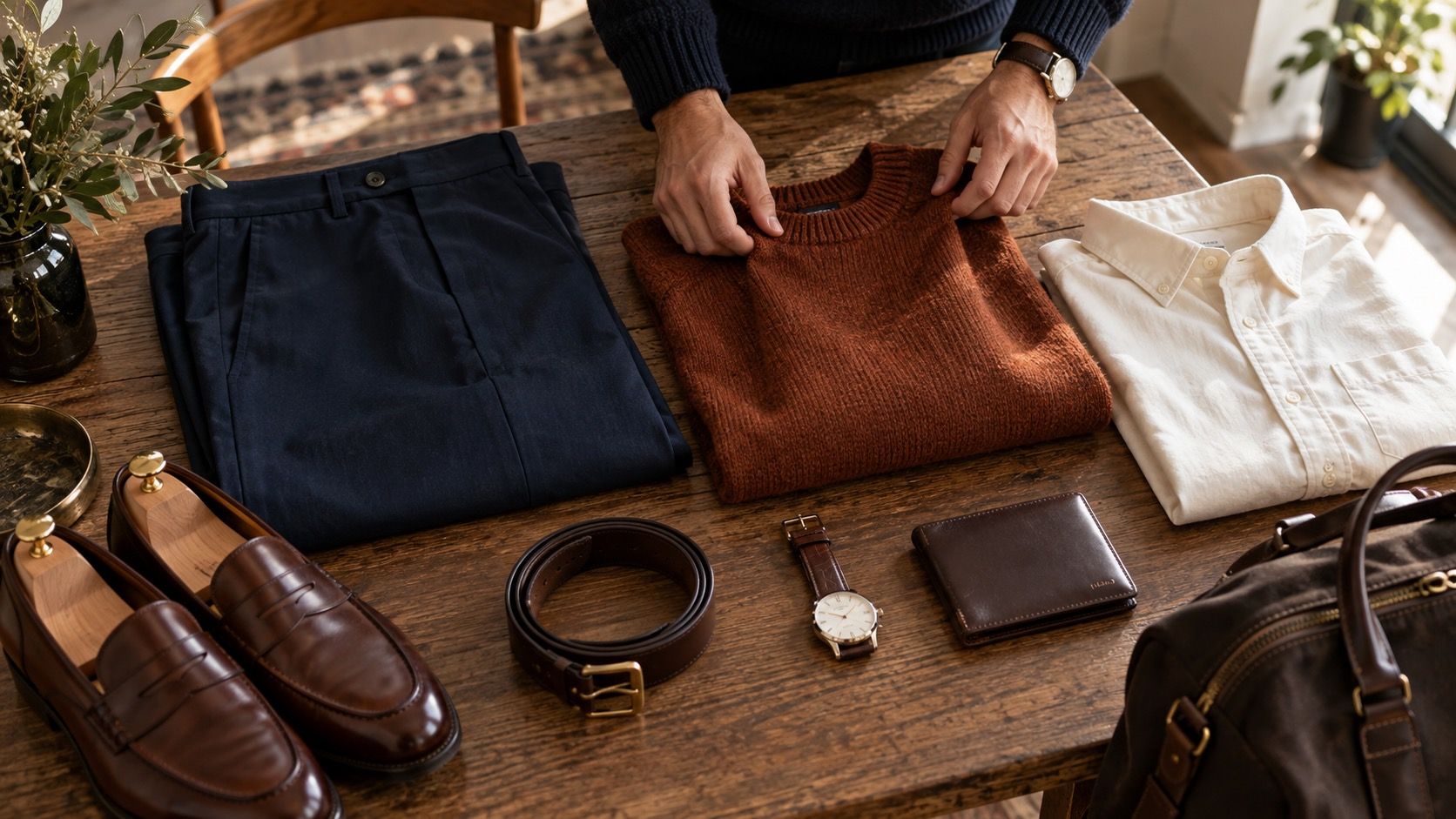
Choose two or three neutrals you actually wear and repeat them. A closet built around black, white, and navy will support a different color palette from one built around camel, cream, and chocolate. Mixing every neutral at once often creates the feeling that something is off. When in doubt, make belt, shoes, and bag echo one dark neutral, then let the top carry the color.
Fix an outfit that feels too busy
Busy outfits usually have more than three visual messages: a patterned blouse, colored trousers, contrast shoes, a statement bag, and shiny jewelry. Remove one thing before adding another. If the print is the point, make the trousers and shoes quiet. If the trousers are bright, choose a top with a simple neckline and restrained hardware.
There is also a useful distinction between color contrast and pattern contrast. A black-and-white stripe already has strong contrast, so it does not need a loud complementary bag. If you want more interest, repeat a small color from the print in an earring or shoe. A good color chart for clothes should make getting dressed easier; when an outfit works, it tends to look simple in the mirror even if the decisions behind it were not.
Proportion is the part a clothing color chart cannot calculate for you. A tiny flash of orange in a scarf can wake up a navy coat; an orange trouser with the same navy coat makes a much larger claim. Start by giving the strongest color the smallest area, then increase it only if the outfit still feels too quiet. This is useful with complementary pairings in particular: burgundy shoes under olive trousers may be enough, while a burgundy top, bag, shoe, and lip all together can turn an ordinary outfit into a theme. When a color feels hard to wear, move it away from the face first. A skirt, belt, or bag lets you keep it without making it responsible for the whole reflection.
Lighting is another reason to test a combination before buying duplicates. Cream and pale gray can look interchangeable under warm shop lights, then pull in opposite directions outside; a blue-gray cardigan may clarify a cool shirt while a yellowed beige version makes it look flat. Take a quick phone photo near a window and look at it in grayscale as well as in color. If the values collapse into one patch, add a darker shoe, belt, or jacket. If the grayscale balance is sound but the outfit still feels unsettled, the temperature or saturation is probably the issue. That small diagnosis is far more useful than starting again with a new color palette.